Brandbook MENA
 Maria Mikhailova
 Irina Smelkova
 Anton Nikiforov
The constants of the brand identity in two language contexts: logo, colour palettes, graphics and typography. Plus examples of implementation on touchpoints.
Logo
We use a flat sign in the form of the letter «D» for brand, digital and promotional materials.
 Download
 Download
The logo has several types, here you can download all of them. Below we will tell you about each type and how to use it.
Classic logo
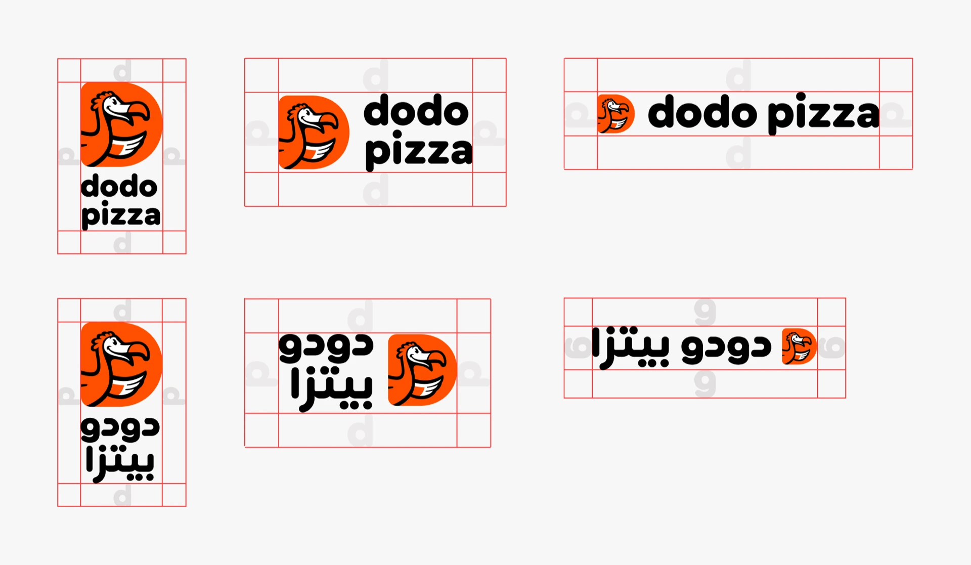
The sign with a descriptor, the descriptor consists of lowercase letters.
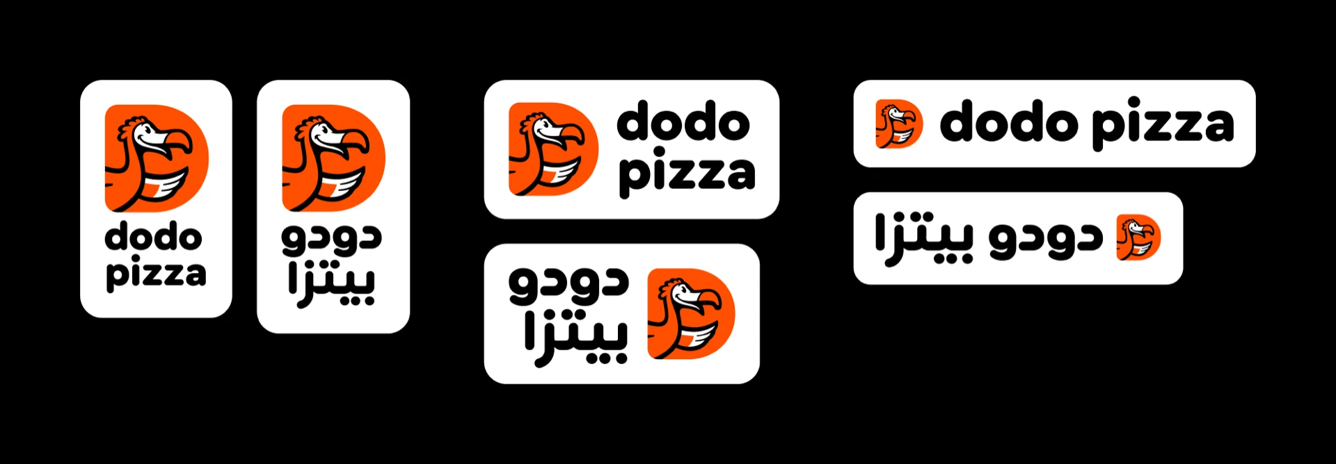
Logo on a white background
Use when the color of the background matches the color of the logo or has low contrast.
How we use the logo in layouts
Generally, we place the logo in the «footer» of the layout, combining it into a single block with additional information.
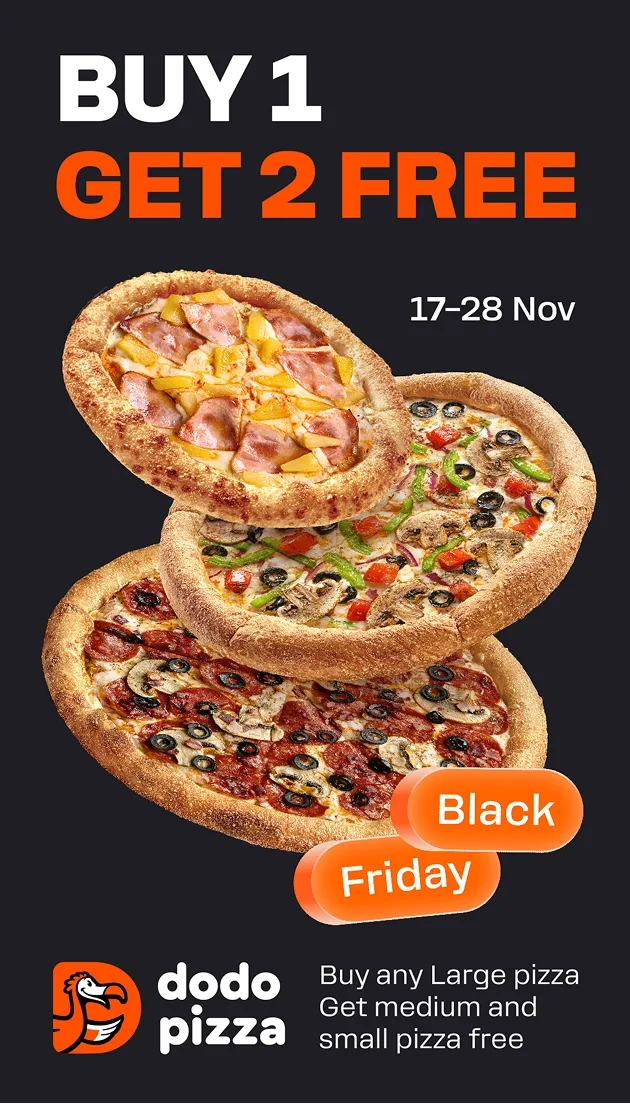
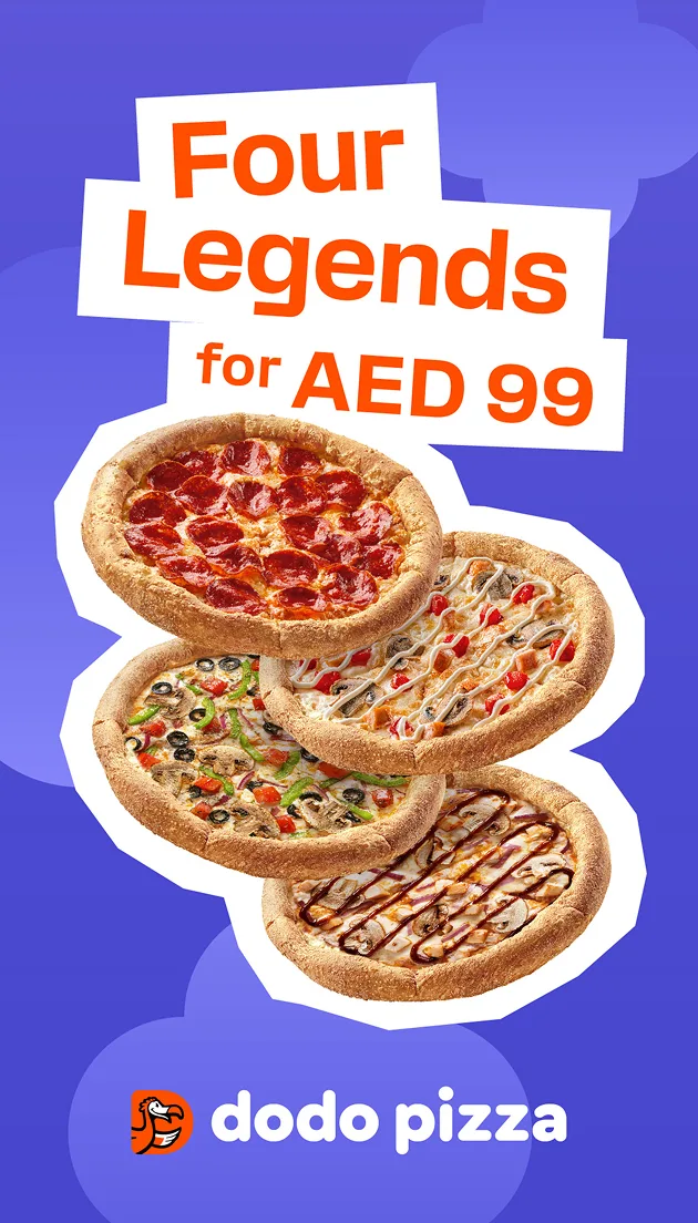
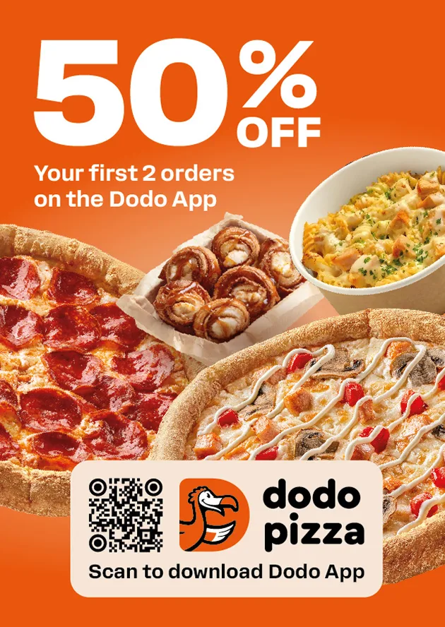
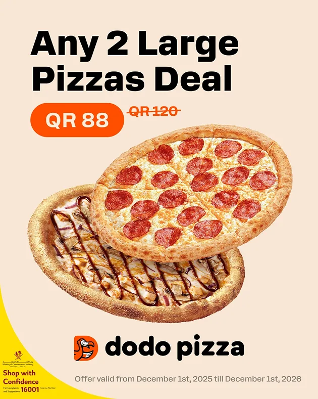
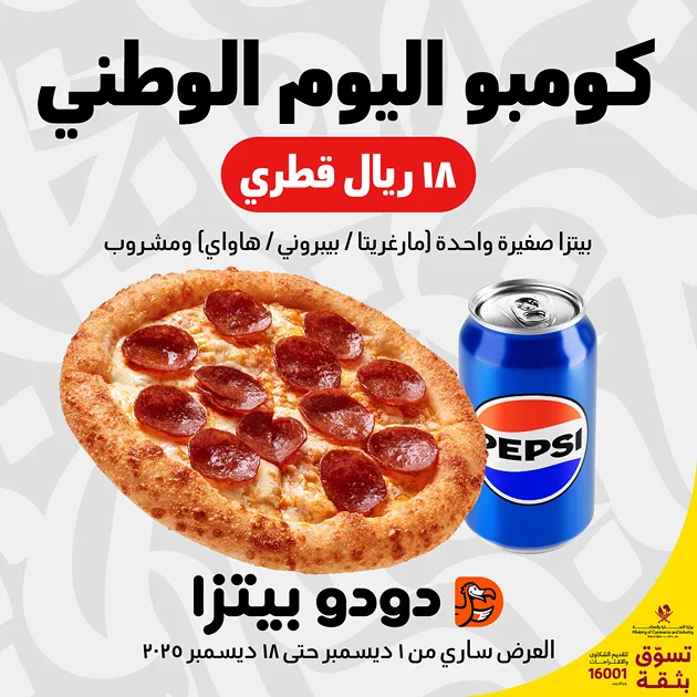
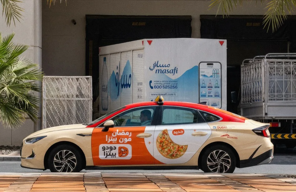
The location may vary depending on the format, for example, in this horizontal layout the logo may be placed on the side.
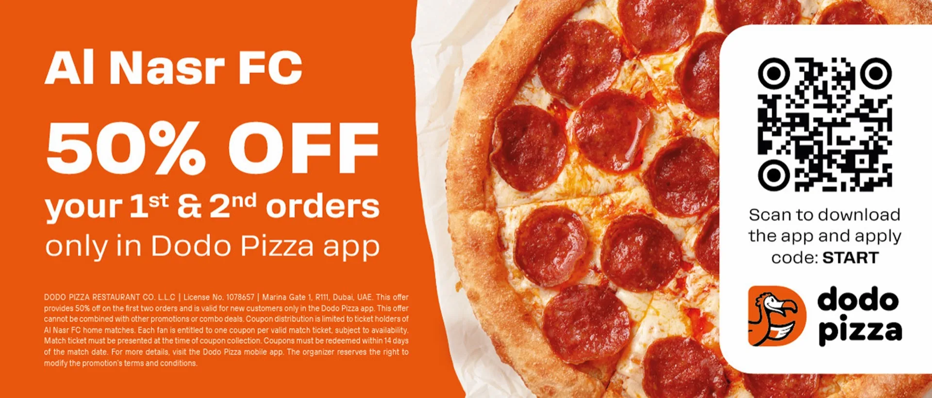
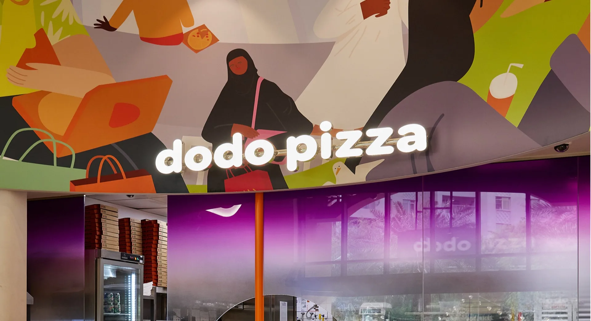
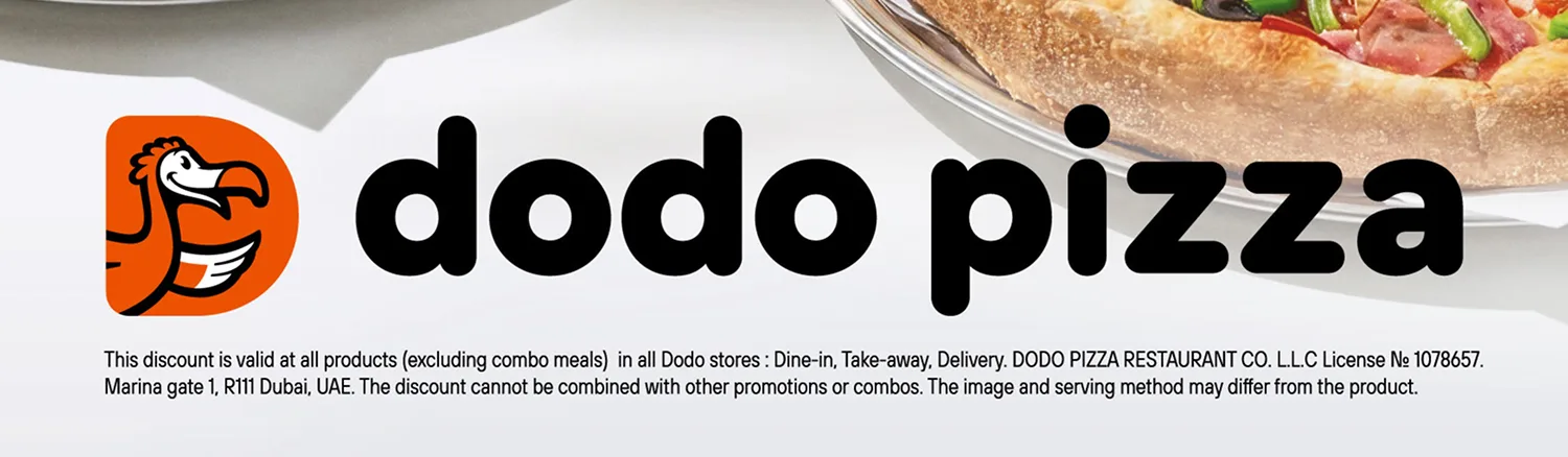
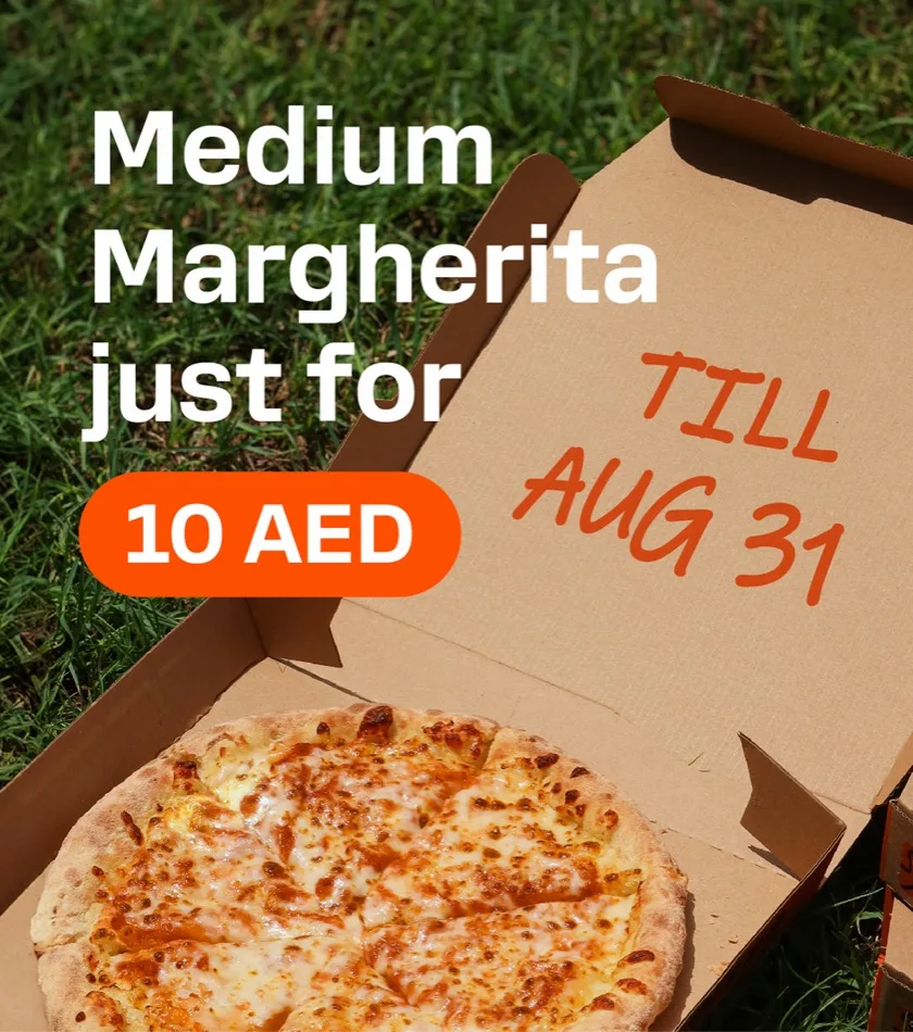
Descriptor without sign. In some cases, we leave only the descriptor. We often use this technique in packaging due to technical printing limitations, size limitations, and background color filling. Or when we need to place the logo on a complex background, like here. On the photo, this is not the main entrance to the pizzeria, so a descriptor without a sign is allowed.
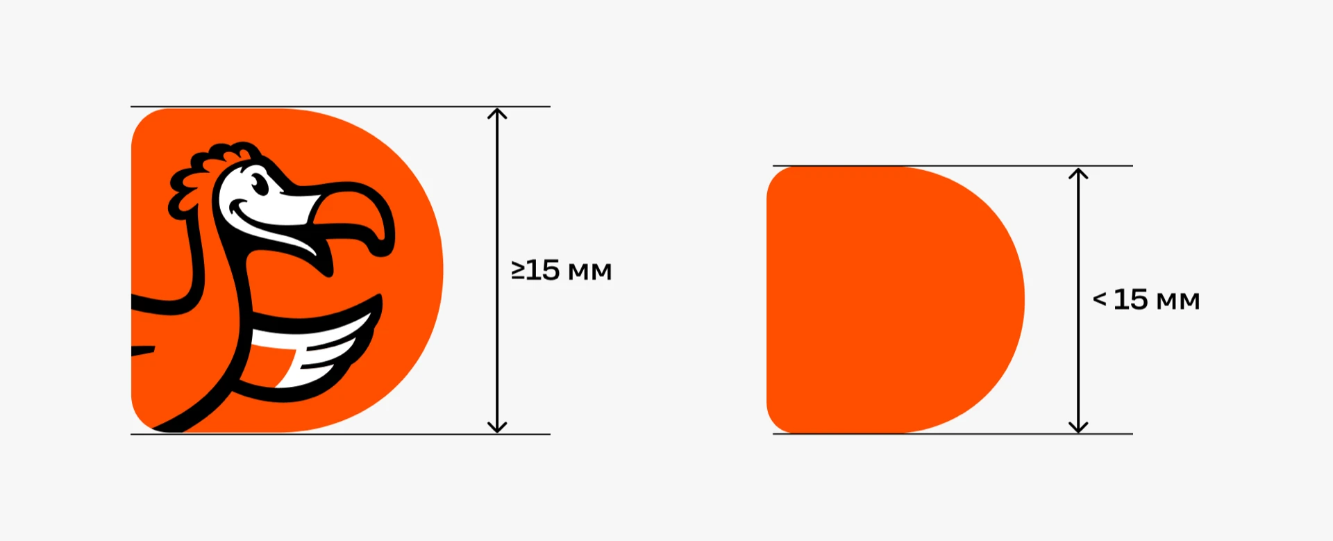
Minimum logo size. The minimum size of the logo with the bird image is 15 mm. If the logo is smaller, it is simplified to the orange form «D».
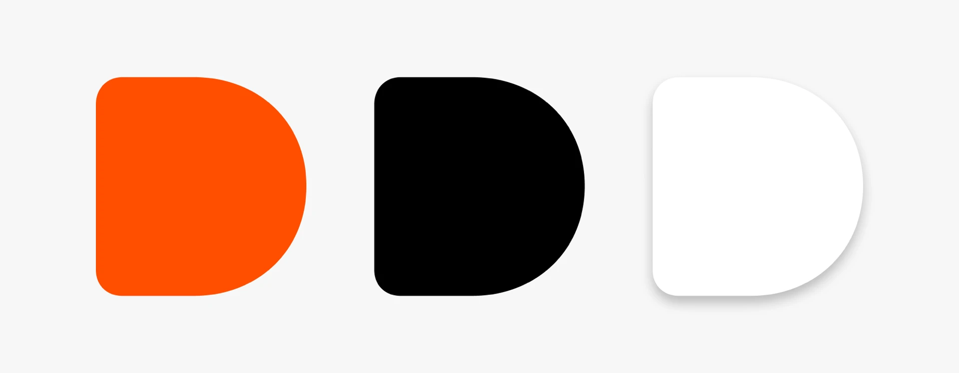
The letter «D» can change color to white or black if it is not possible to use the brand orange color.
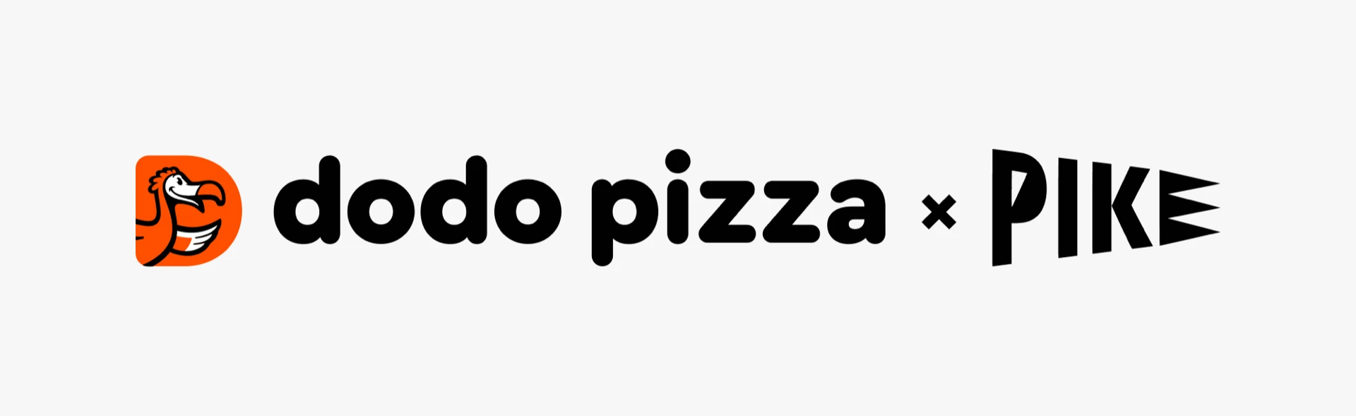
Co-branding. In collaborations, we combine both logos using a separator — the multiplication sign (×). When Dodo Pizza is the main venue for the advertising campaign, its logo is always placed first.
Icons
We actively use them in the application. Sometimes we add them to the layouts.
Colours
The palette is built on the main colors of the mascot — the Dodo bird.
Fiery orange
This is the Dodo Pizza brand colour. Our visual communication aims to be as orange as possible.
Copy colour Colour copiedBeige
The second base colour — we set text in this colour on orange and dark backgrounds, and use it for background fills.
Copy colour Colour copiedBlack
Base colour. We use it for text and in navigation.
Copy colour Colour copiedGrey
Used to display the old price.
Copy colour Colour copiedPure white
The third base colour — we set text in this colour on orange and dark backgrounds.
Copy colour Colour copiedThere are also colors for positioning, which are used to indicate the types of consumption.
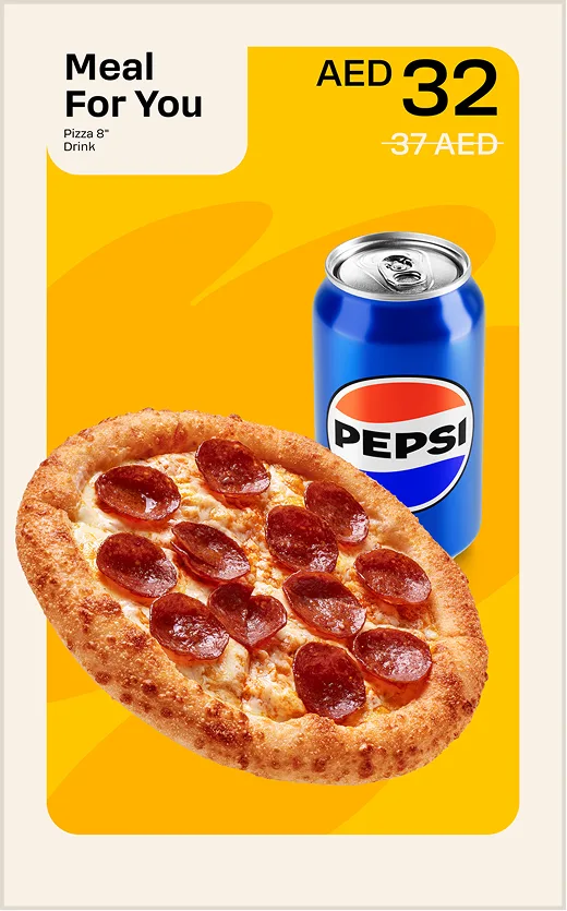
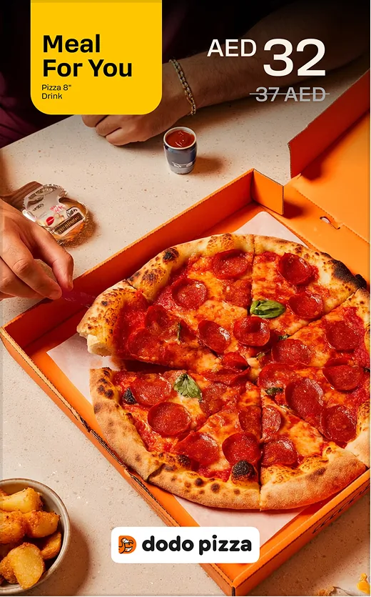
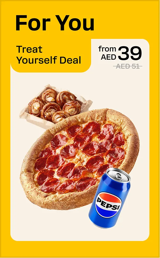
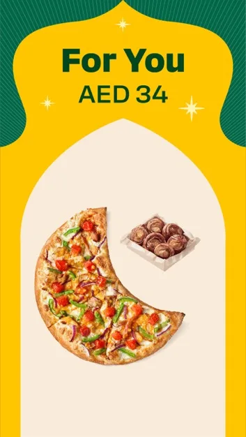
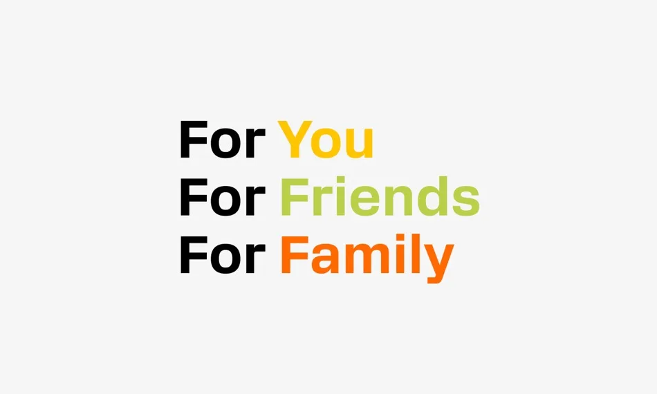
For You
Soft yellow: individuality, self-attention, comfort, self-care.
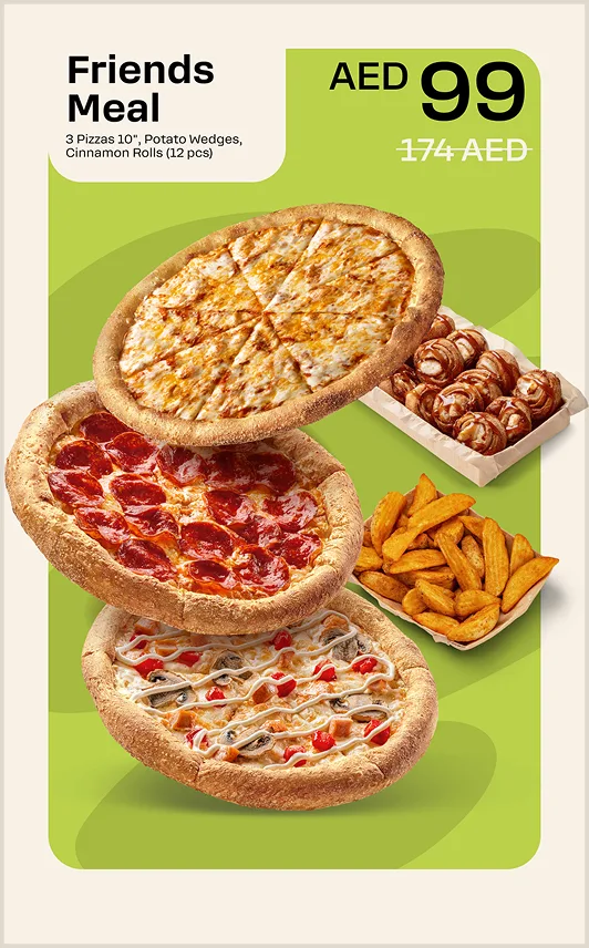
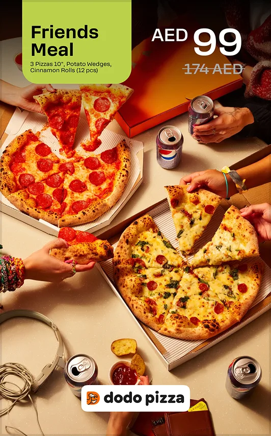
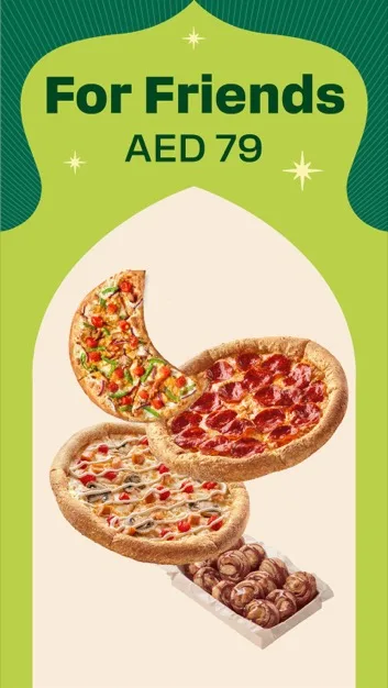
For Friends
Warm green: neutral, modern, and friendly.

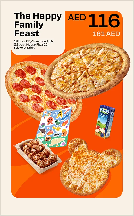
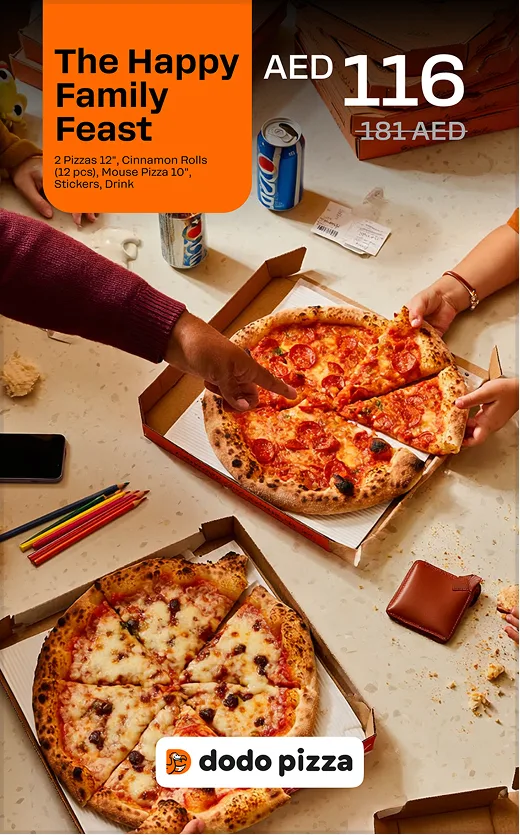
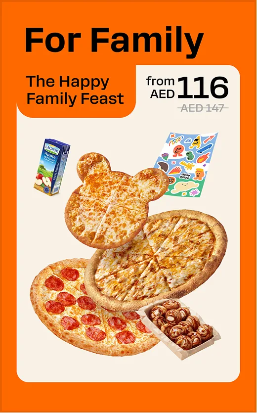
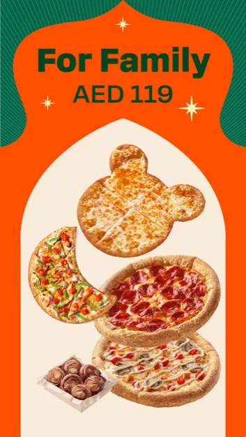
For Family
Orange Dodo: support, trust, family atmosphere.
Positioning adaptation
An example of adaptation to the Ramadan style. We keep the functionality of categories in the context of thematic design.
Fonts
For English and Arabic languages, we use different fonts. Also, there are main and additional fonts for different types of text.
Main
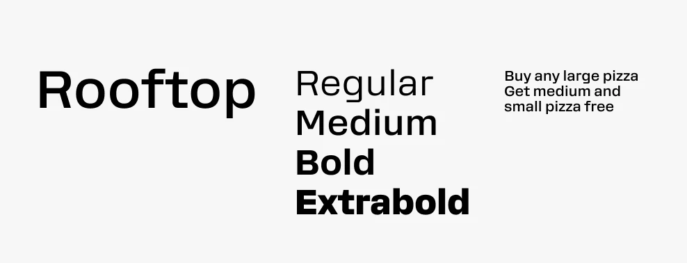
Rooftop. We use it in communications, in printed materials and on digital media. It is not suitable for large texts where there are more than 4 lines. In such cases, we use TTHoves.
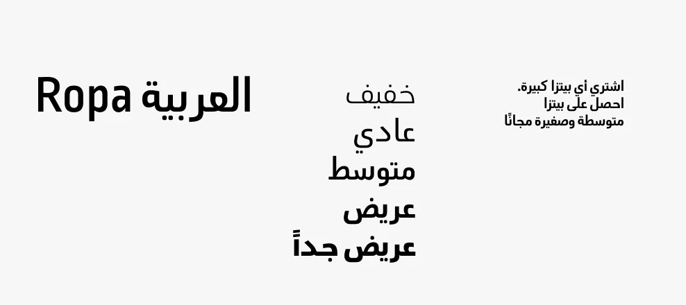
Ropa Arabic. Used for translating creative materials into Arabic. When creating a visual in two languages, we increase the size of the Arabic text by a few points, because the height of the characters in the fonts is different at the same size.
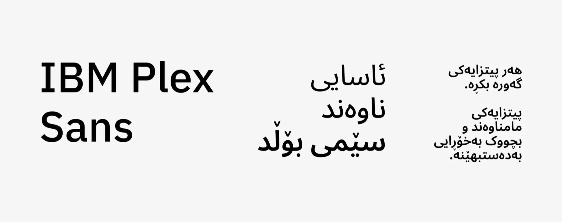
IBM Plex Sans. Used for all creative adaptations in Kurdish. The height of the characters in the fonts is different at the same size, so when creating a visual in two languages, we increase the size of the Arabic text by a few points.
Additional
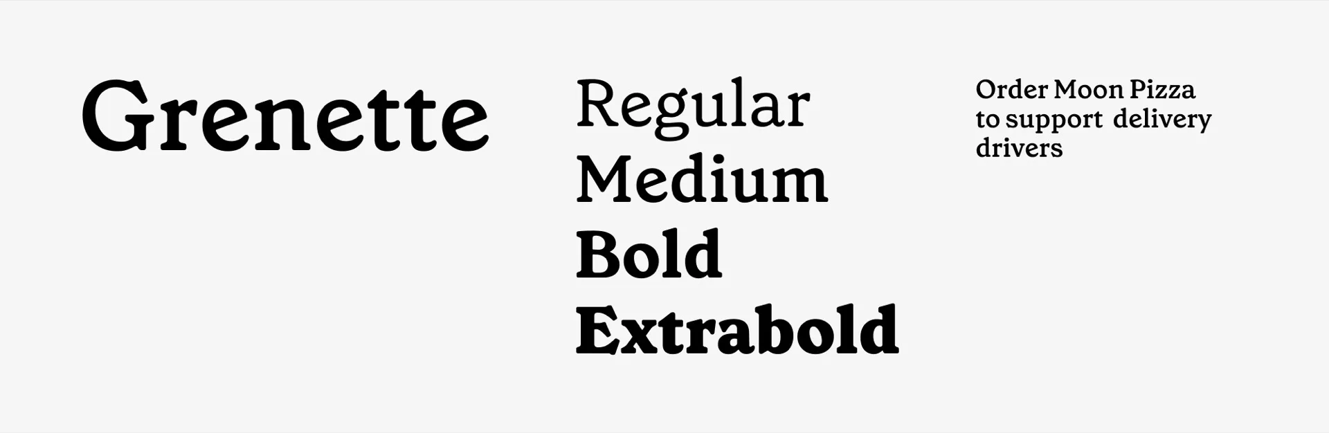
Grenette. Used as an accent font for pizza names and headings of special projects.
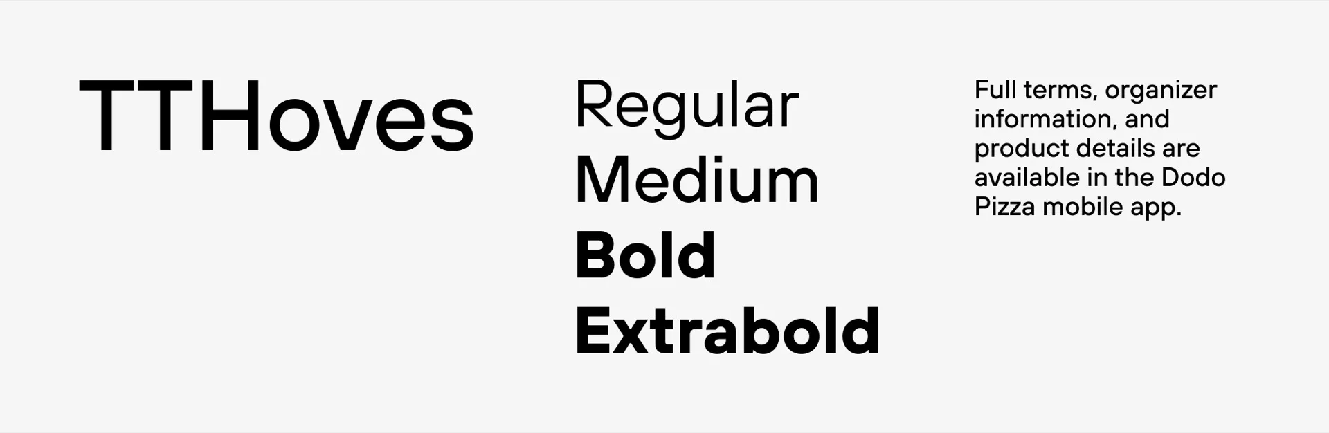
TTHoves. Used for large texts: legal information, product descriptions on packaging.
Lettering
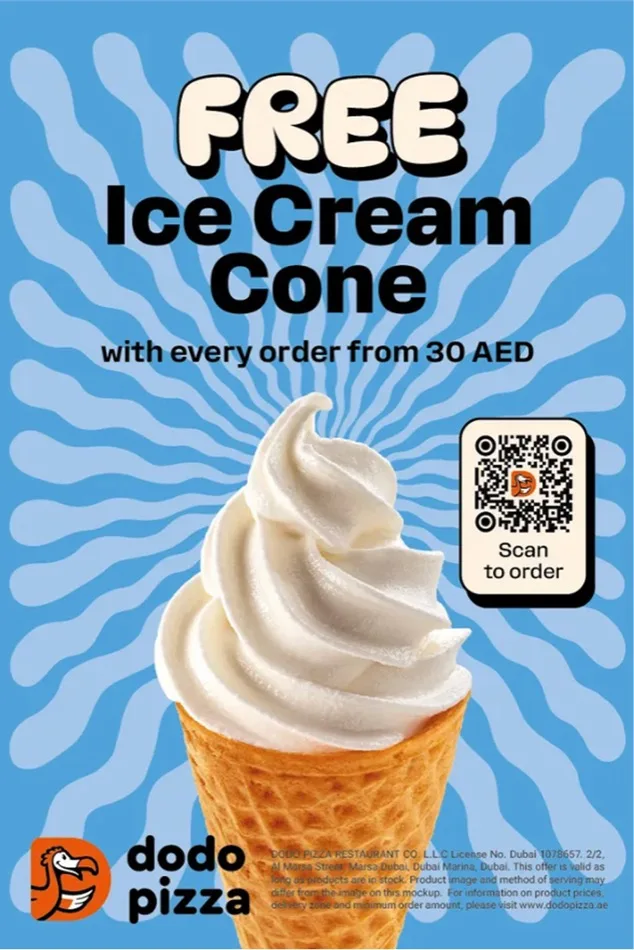
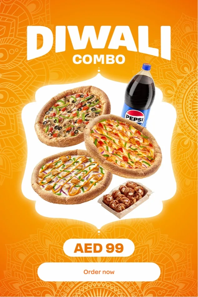
We use for headings of special projects, developed specifically for the task.
Text formatting rules
We use uppercase letters for text and titles.
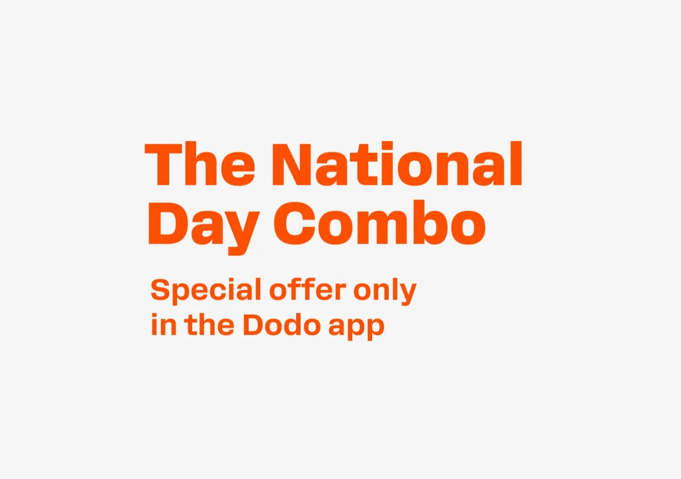
Phrases requiring the most attention are written in uppercase. For example: FREE, WOW, OFF.


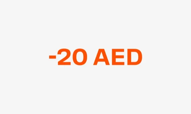
Heading. Font Rooftop, extrabold or bold, line spacing 90–100%.
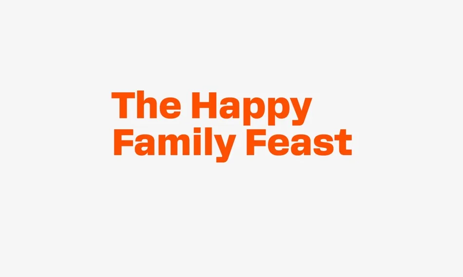
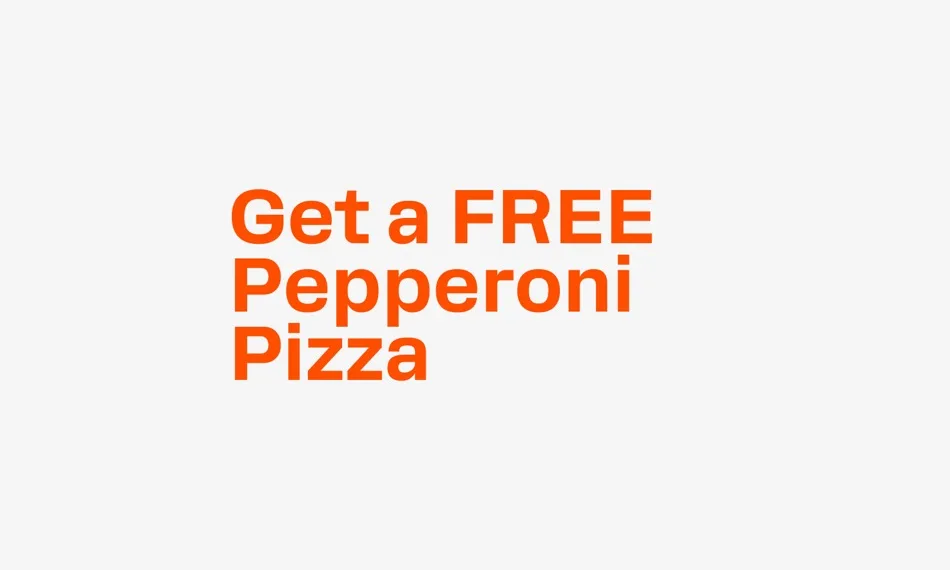
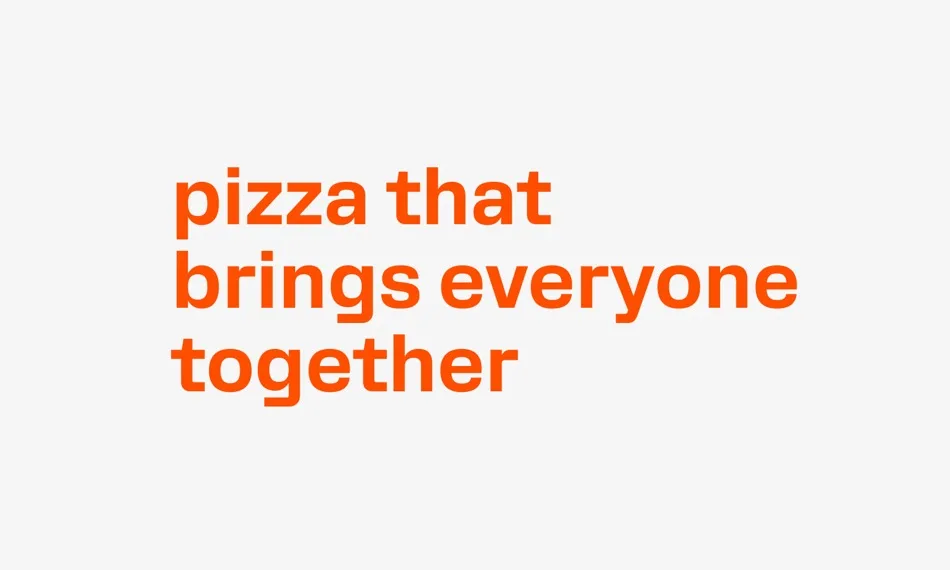
Line of new positioning: Rooftop bold, line spacing 110%.
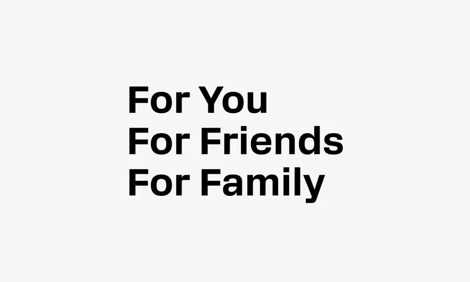
Subheading. Rooftop, extrabold or medium, line spacing 100–120%.
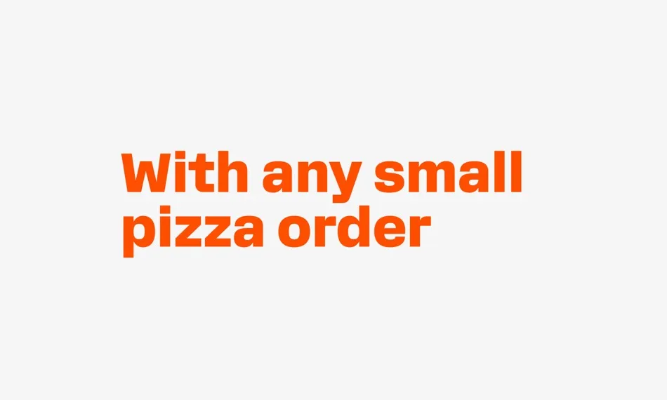
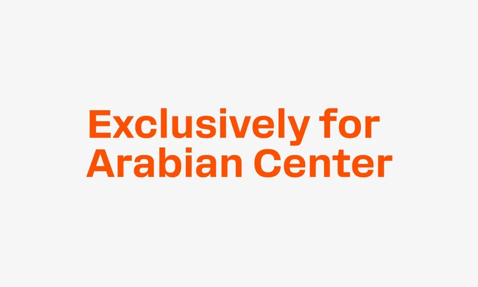
Legal copy. TT Hoves or TT Hoves Cond. For short legal copy of 1–2 lines, Rooftop is allowed. Line spacing 100–120%.
Line spacing
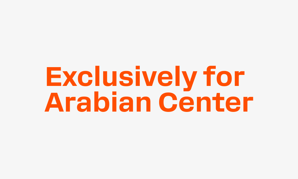
Line spacing in headings, subheadings and base text, font and strikethrough of price tags, highlighting the benefit, digit spacing with spaces.
In headings. The value of the line spacing varies from 90 to 110%. It is smaller when the heading consists of two lines and there are no ascenders and descenders. And larger when the heading consists of three lines and there are ascenders and descenders.
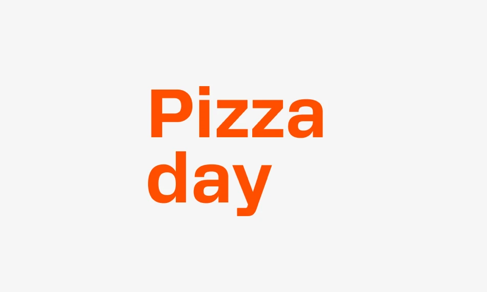
It is larger if the heading has more than three lines or the letters have many ascenders and descenders.
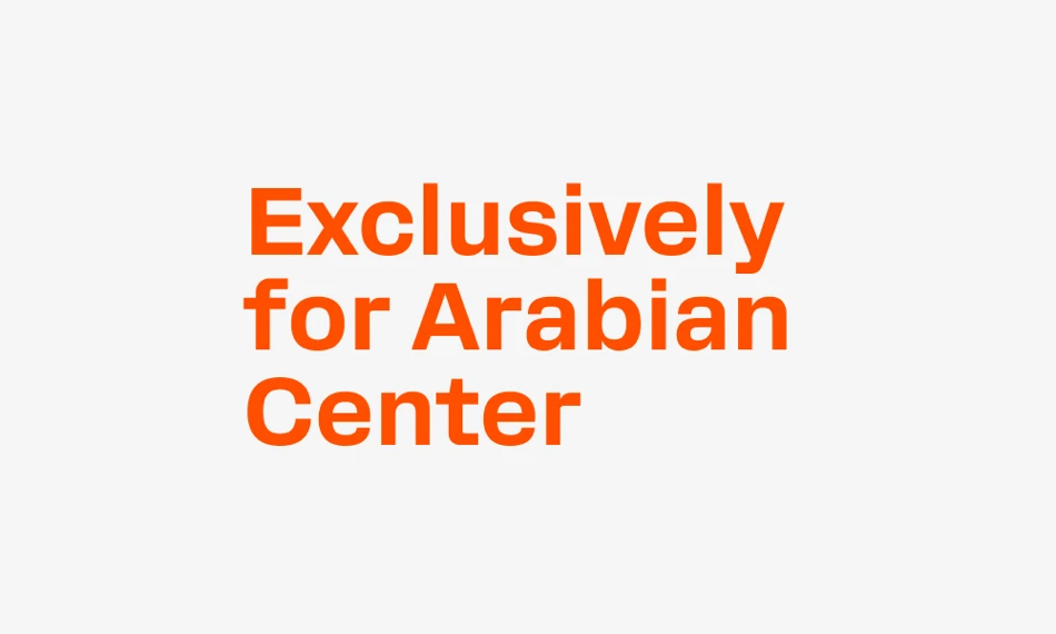
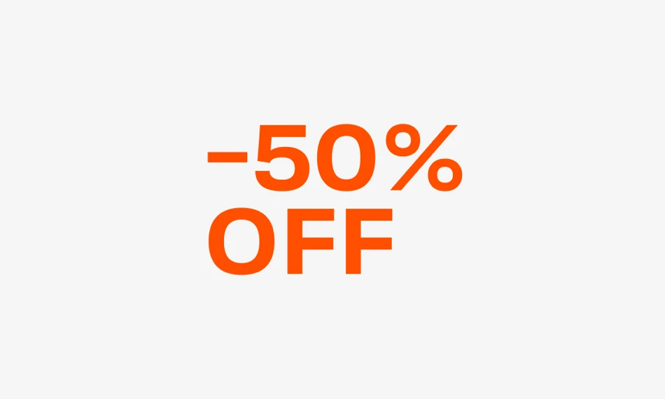
In subheadings and body text. Line spacing values range from 100 to 120%.
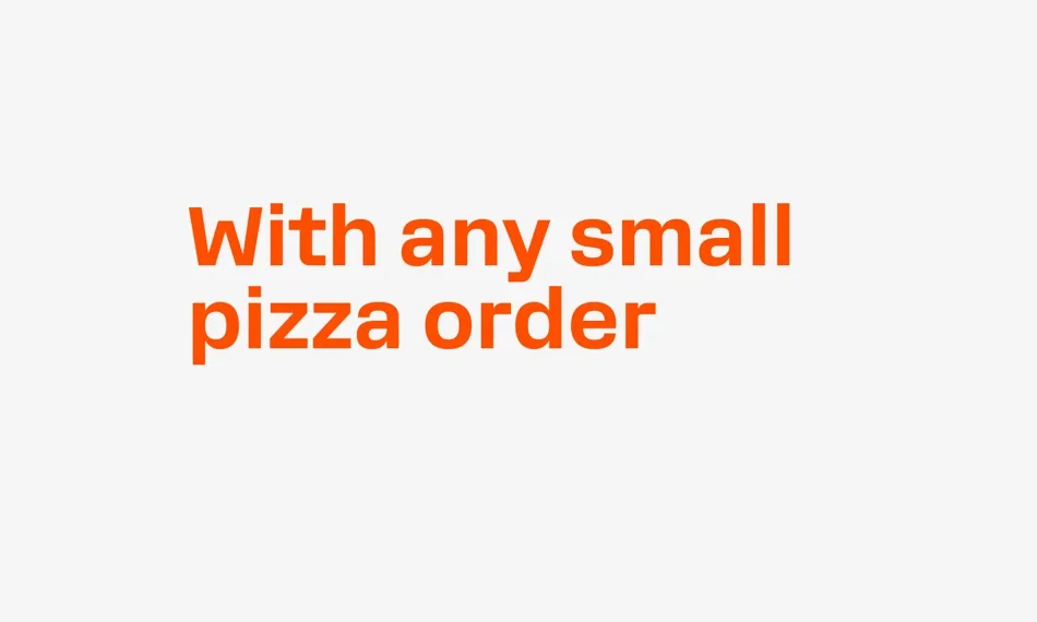
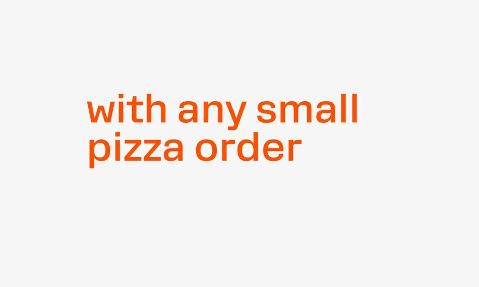
It is larger if the subheading has more than three lines or the letters have many ascenders and descenders.
Price tags
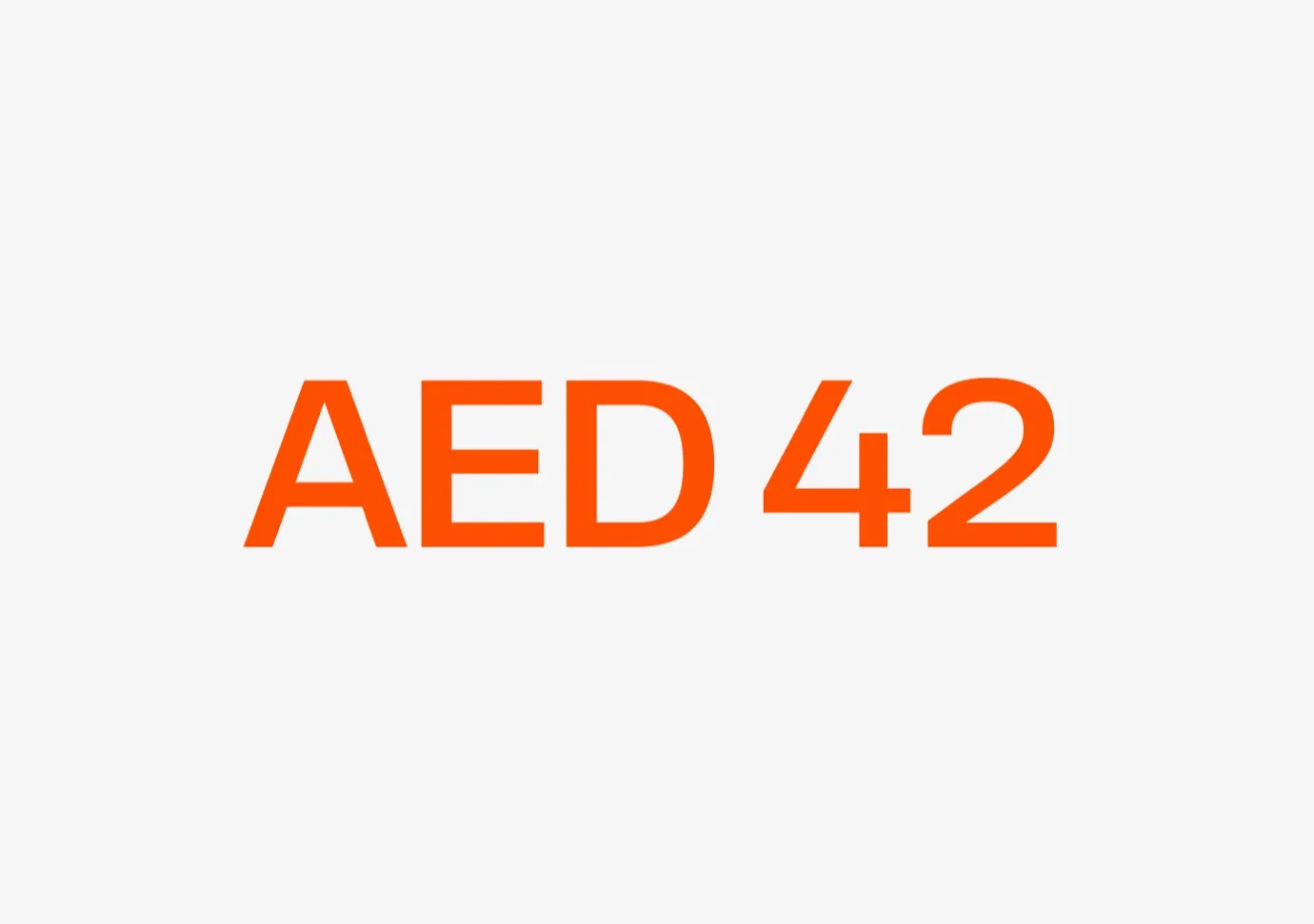
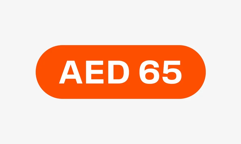
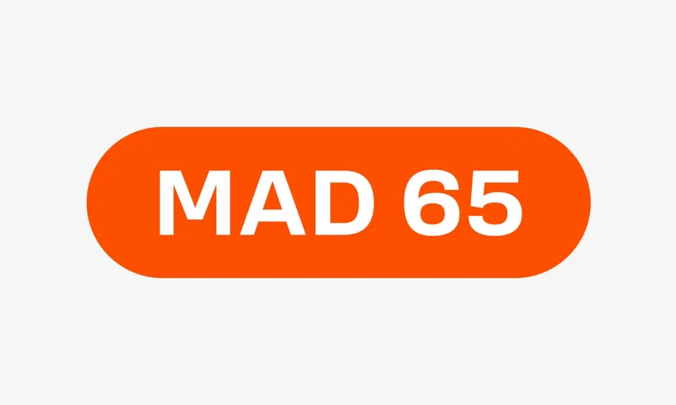
The font of the price tag corresponds to the style of the heading. When placing one-two price tags, the figures and currency designation are made of the same height for consistency.
We use a narrow space between the currency symbol and the figures.
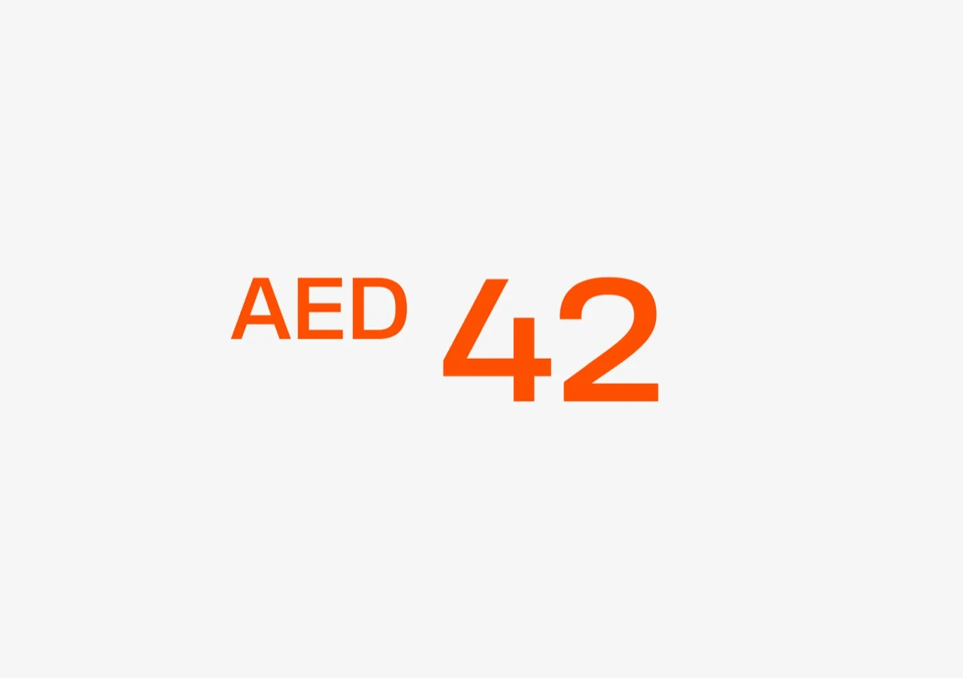
We use a different size composition to highlight the benefit: the figures are 40–50% larger than the currency designation. In cases where the currency symbol is smaller than the price, it is aligned with the top edge of the figures.
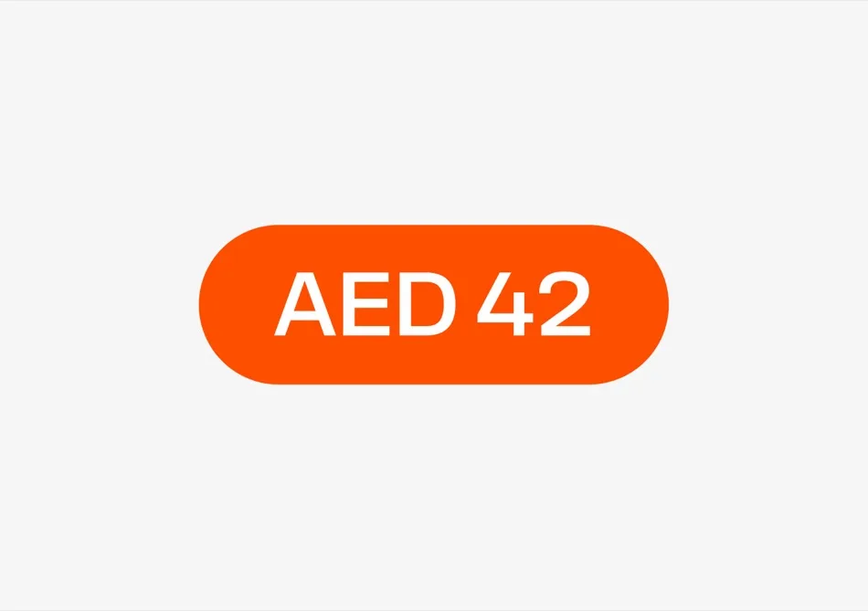
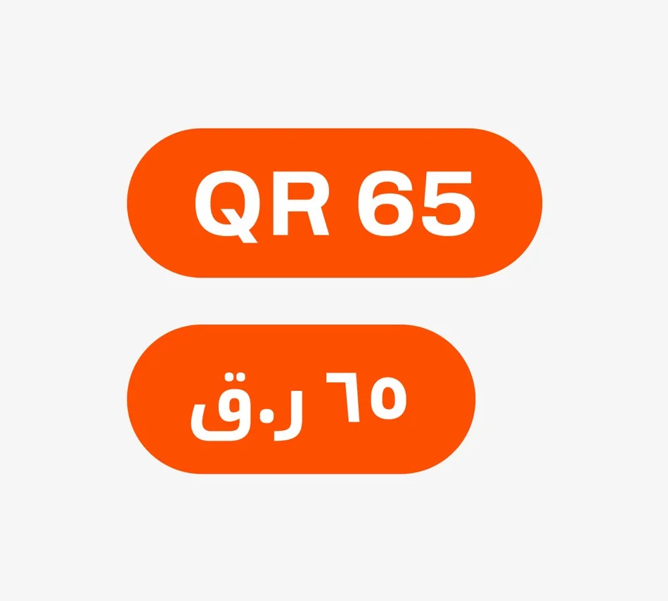
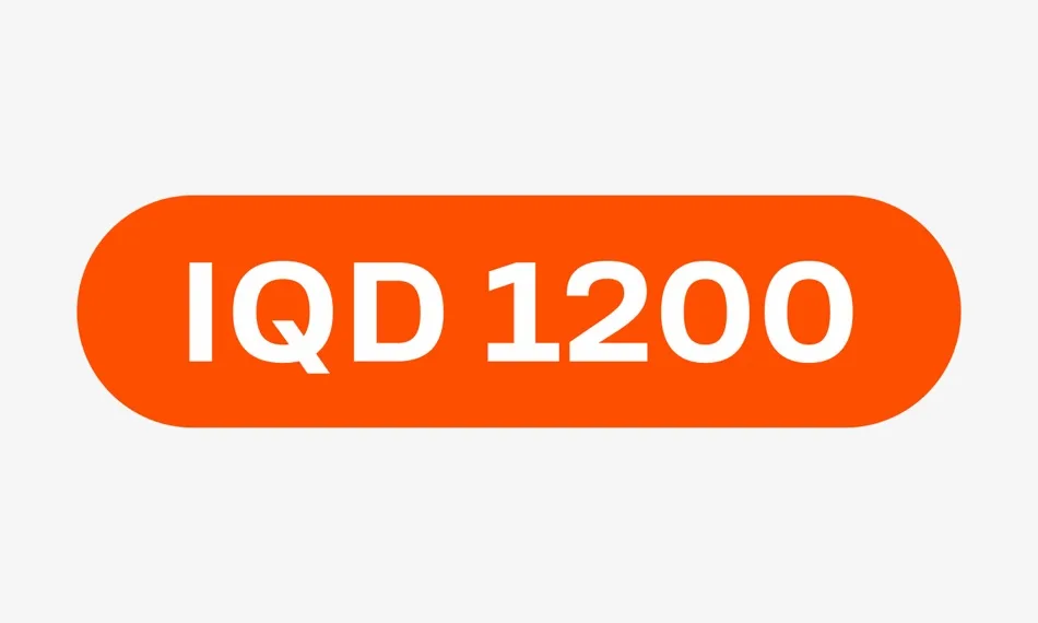
On complex backgrounds, the price is placed on a plate, while the figures and currency are made in the same size.
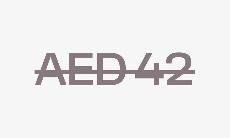
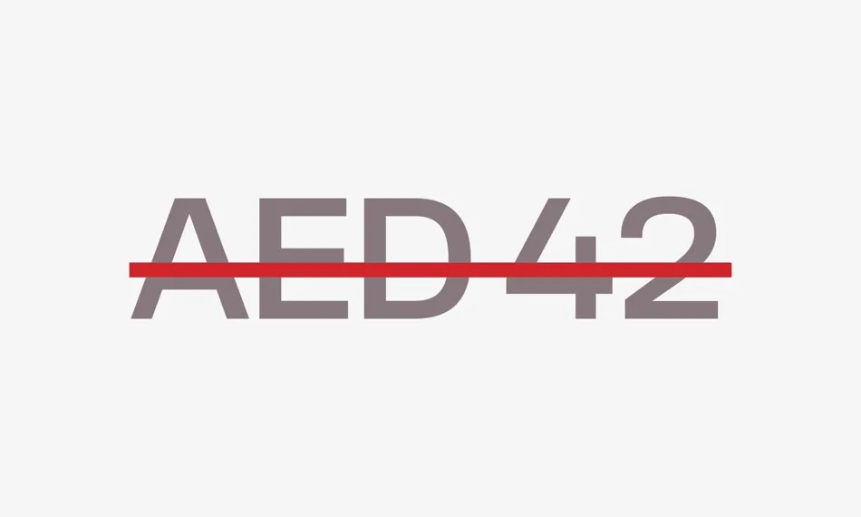
Old price
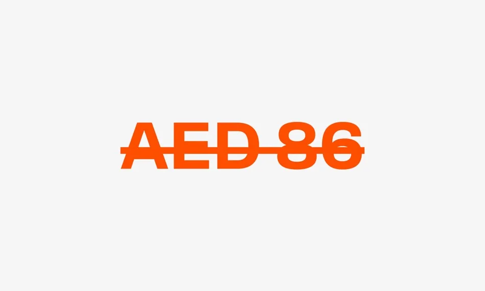
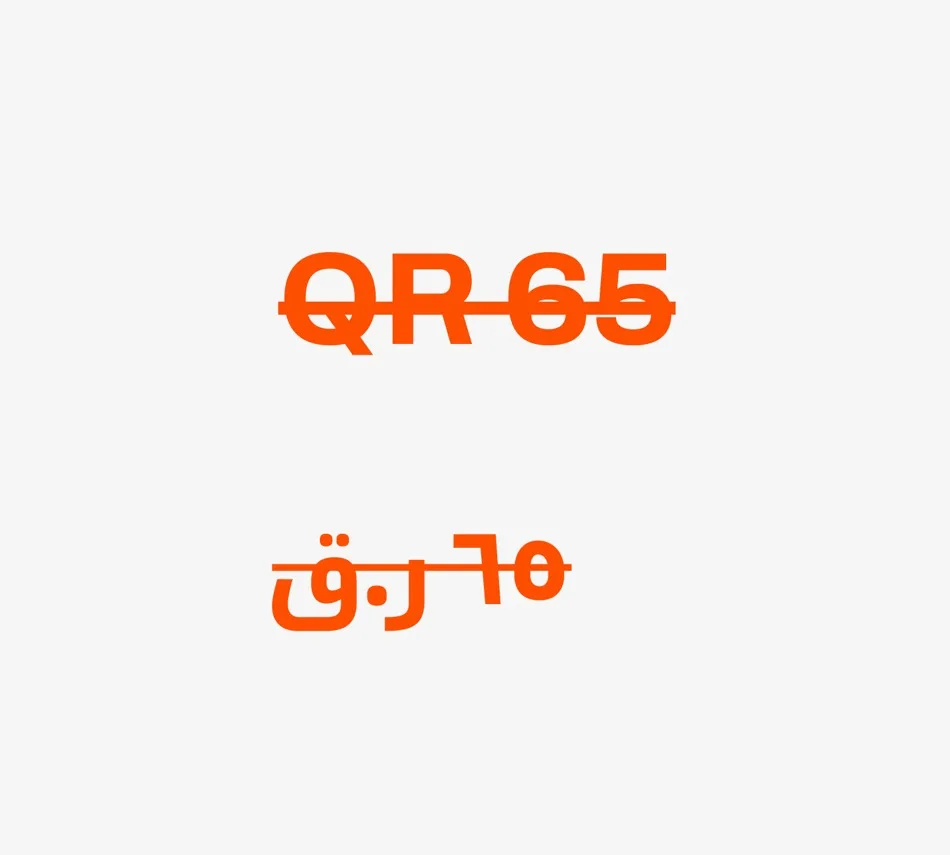
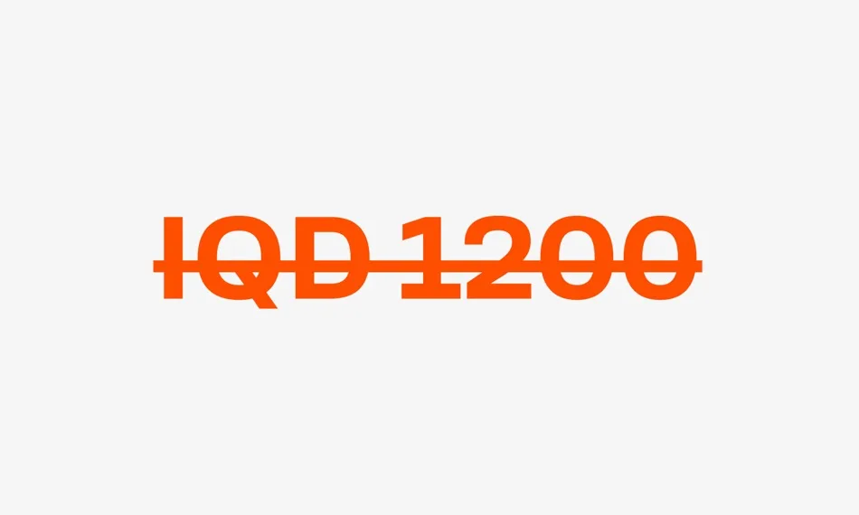
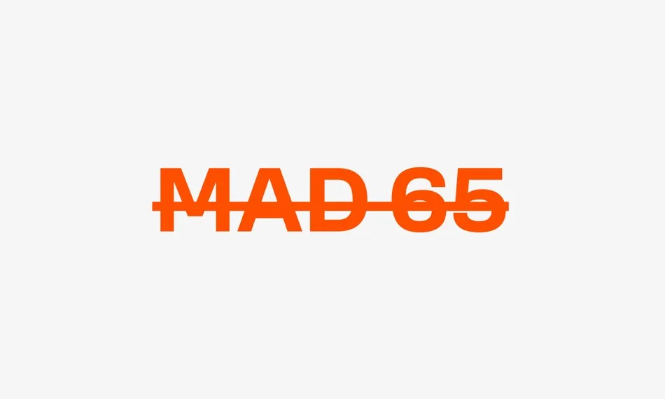
We strike through with a straight line. The color of the strike-through is the same as the price or red.
Price tags in MENA region
The rules for placement and strikethrough are the same. Here are examples of implementation in different countries.
Shapes
We use shapes of different forms to add texture, highlight or add depth. Also, we use them as containers for photos.
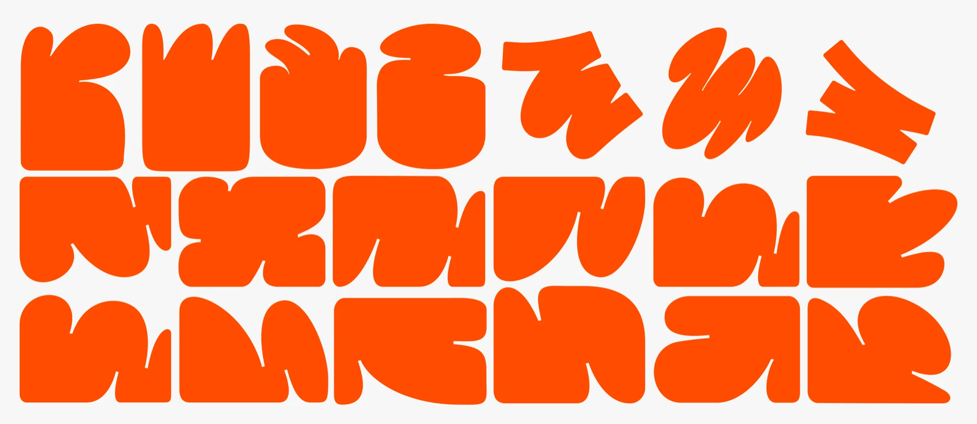
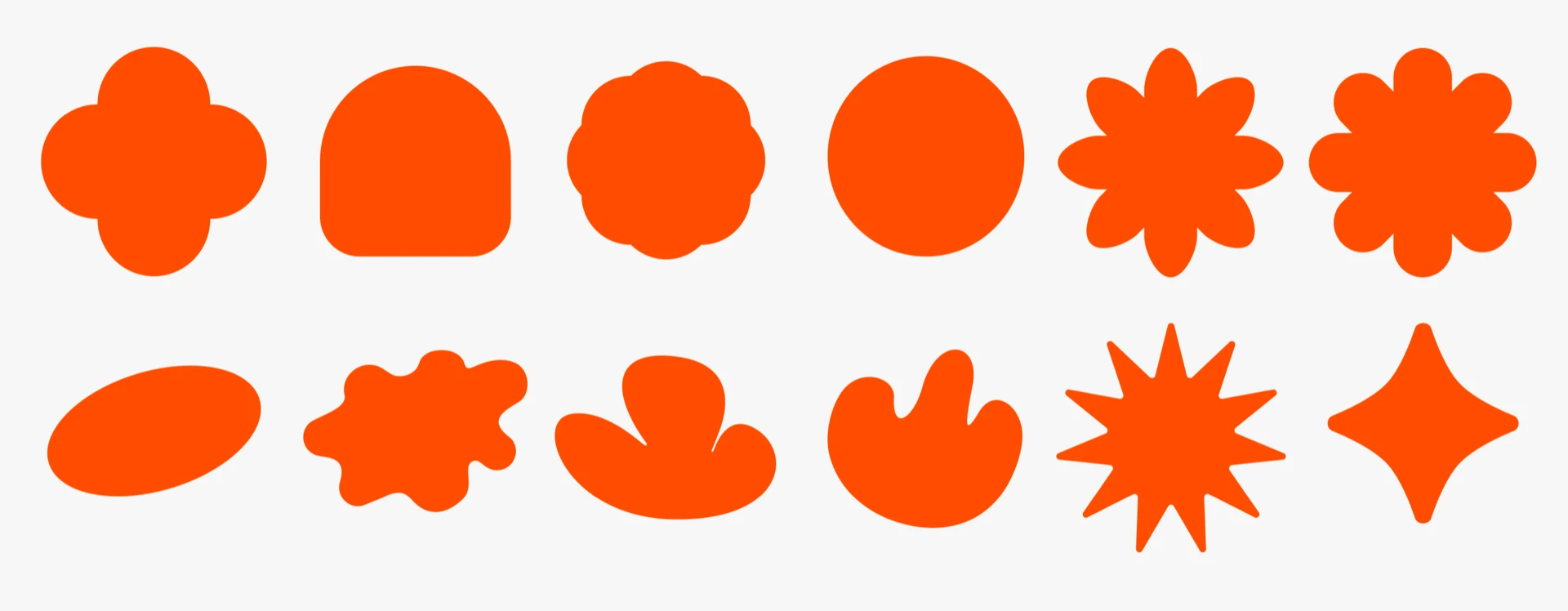
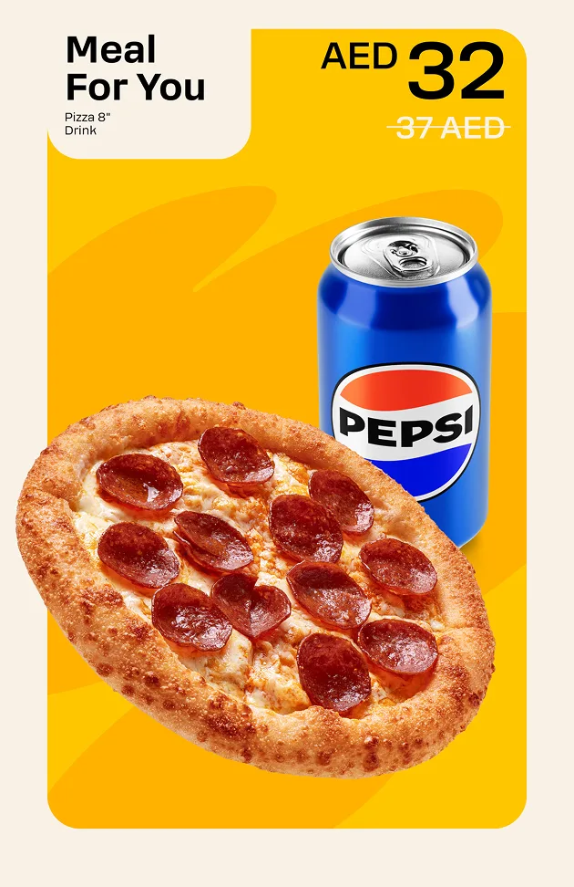
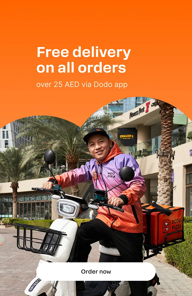
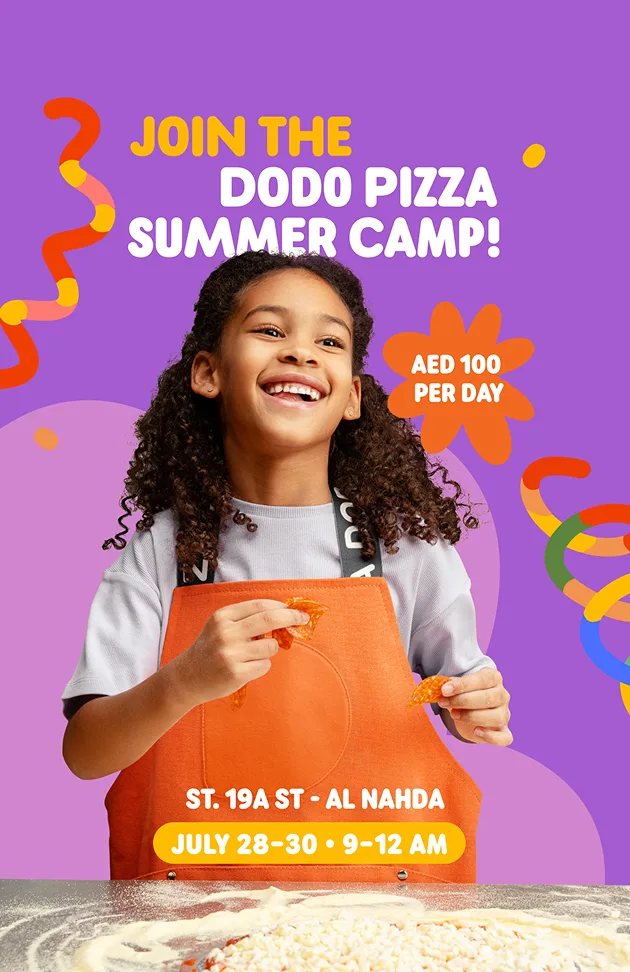
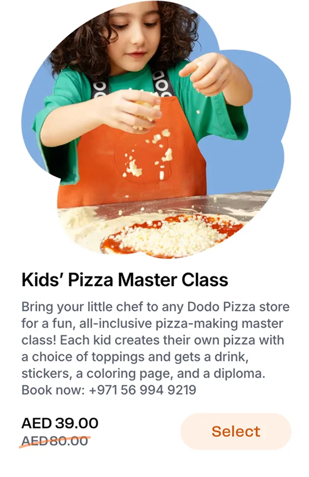
We do not use bubbles as plates under prices.
Summary
We choose the logo by touchpoint and background context: we use only approved versions of the sign and descriptor, do not change proportions, do not distort them, and do not create manual custom combinations. We always keep a safe zone around the logo and check the minimum size at which the mark remains readable in digital and print formats.
In co-branding, we keep a single placement order and visual priority of marks so partner hierarchy remains stable across all touchpoints.
For colour, we rely on core and extended palettes with exact values and always verify contrast on both light and dark backgrounds.
In typography, we match the font to the task: Rooftop for accents and headings, TT Hoves and TT Hoves Cond for long and technical blocks, and Grenette only as an accent typeface. When working with shapes, we preserve proportions and form logic, use them as containers, and avoid bubbles as price plates.
Before publishing, we review touchpoint compositions in both languages so the Arabic and English versions stay consistent in meaning, hierarchy, and visual rhythm.
If you need a new template or have usage questions, contact the guide owners: Maria Mikhailova and Irina Smelkova.